Thursday, December 12, 2013

Final Project


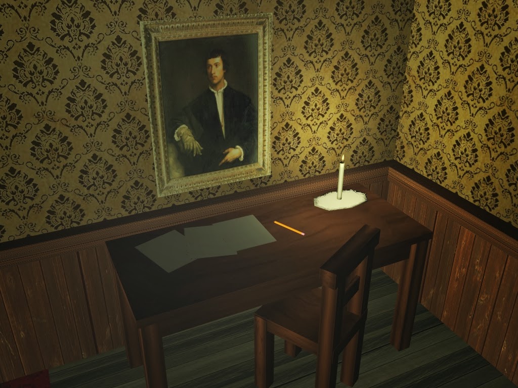
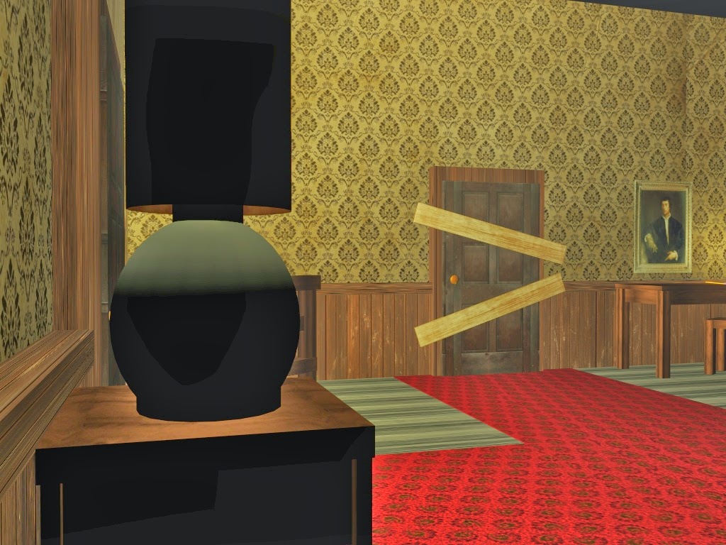
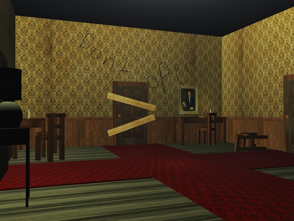
For my final project, I used the same layout that I have been working on for a majority of the semester. I acquired Maya on my home computer so I have been working on it for quite sometime. I spent a majority of the time adjusting the lighting for different light sources. A main spotlight, a few candles, and a lamp. Adjusting the textures as well were somewhat challenging. I modeled everything as well, the candles taking the most time. The final jpeg has some simple paint effects drawn onto the walls to include a walking dead style composition. The quality has increased as I spent time working on the model. Even though its very simple and reminiscent of Nintendo 64 games, I'm pretty proud of my work and i have learned a lot from this class. 

Monday, December 9, 2013

Upgrade an Assignment: Part II - Final

Interior Design


Exterior


This was my simple 3D render of the colonial house with a simple surface background to give it depth. I included what would be the interior level of the house. Adjusting the textures was a bit challenging but I think i managed. Nothing too amazing but for my skill level i'm happy.

Saturday, December 7, 2013

Upgrade an Assignment: Part II


For my upgraded assignment i wanted to bring this simple colonial house in Maya, and construct a 3D simple version of it. Trying to keep within similar color schemes as well as textures. 

Thursday, December 5, 2013

Upgrade an Assignment: Part I - Final


These are the renders of my upgraded assignment. The original assignment was pixel art of a standard axe. I wanted to take it a step further and model a 3D axe. I did the best i can since i'm still learning maya. Overall, the textures seem to be placed well. I added a simple grass texture as well as 3D grass and shrubs. A moon texture background illuminates the object. 

Thursday, November 14, 2013

Upgrade an Assignment: Part I - 11/14

I will be upgrading my texture pixel assignment. I would like to turn this simple pixel art into a full blown 3D render using MAYA. It's a simple project that will introduce me to sculpting polygons for a professional and artistic looking product that could be seen in a game that I would indeed purchase for myself.

Tuesday, November 12, 2013

Maze Texturing Assignment 11/12


These are my new and improved renders for my maze. I did a lot more researching into how to use the program and learned about my polygon placement, as well as texture alignment and lighting effects. These specific lighting effects are simple spotlights that provide such an eerie vibe that i was looking to highlight in my game. Instead of having a simple textured wall, i added wood siding for more realism and detail. Also, a simple red carpet for even more detail. I'm extremely happy with my improvement and feel i'm really getting the hang of MAYA.

Saturday, November 9, 2013

Maze Texturing Assignment -11/9


These are my professionally done video game concepts.


These were all taken from Red Dead Redemption. Regardless of the setting, i'm trying to match the level of detail and design. They provide a level of lighting, props, and design that would definitely benefit my overall project. 


Tuesday, November 5, 2013

Maze Modeling Assignment - Final Render


Here is the Final render of my maze in Maya. I kept with my concept art created in photoshop. It's extremely simple since i'm still getting a hang of the program, Maya. I did my best to make sure the textures were properly sized and matched the floor plans a house of that time period. 

Sunday, November 3, 2013

Maze Modeling Assignment Render

This is a quick render of my eventual maze project in Maya. Since my concept design was that of an old colonial house, i wanted to keep with the design using these simple textures of worn down wallpaper, wooden floors, and a simple wooden door. This provides a creepy aesthetic to compliment my game concept.

Tuesday, October 29, 2013

Maze Design Final


As you can see from my final hallway art, it is very similar to my concept photos. Having that 1800s style, yet being an old colonial style house with a very creepy vibe to it. I added some lighting effects in the background to give the look of light behind the door. I also added a rug on top of the carpet texture and a painting that's slightly titled.

Thursday, October 24, 2013

Maze Design Concept

For my idea, i would like to use my DUDLEYTOWN game idea and incorporate it into the Maya Maze. I was thinking of either using underground dark tunnels that would be common in the 1800s or old colonial style houses of that time. It fits the setting of the game and gives a very dark and creepy factor that i'm looking for.

Church


Underground Tunnel

Colonial House


Tuesday, October 22, 2013

House Prop Finished


I went through the image and traced the lines, similar to the smaller prop project. I decided to use some of the filters to give the walls and roof a little more depth. The color palette really reflects my game, neutral tones that are dark and dreary. Overall i feel my pixel art is starting to improve.

Saturday, October 19, 2013

Week 8 Large Prop Research


Since my game takes place in the 1800s, i am going to do my larger prop based on the houses/churches of the time. Old style colonial houses which i feel provides that symmetry that would easily transfer to pixel art well. Maybe add the church as well if they're time, to provide that background city atmosphere. 

Thursday, October 17, 2013

Week 8 Final Pixel Art Prop

My research phase first consisted of doing a skull, but i'm not that skilled in pixel art so i decided to do something smaller and easier. I went with an axe which fits the 1800s period. I first traced the outline for the axe and then selected my basic color palette which contained dark to light grays and dark to light browns. I colored the head to make it look weathered just like the original image. As for the handle i blurred the three colors to give it a wood like tone.

Tuesday, October 15, 2013

Week 8 Pixel Art Prop

For my Pixel Art Prop project, i chose to do a skull that could be seen throughout the game. The Basic colors and the highlights will transition perfectly to the pixel art. 

Thursday, October 10, 2013

Week 7 Logo Final

Still image

Main Animated Logo

Alternative Animated image 1 (Black)

Alternative Animated Image 1 (White)

Alternative Animated image 2

The two alternative animated gifs are images that I think could best represent the look and feel for the game without revealing too much. The still image is the basic logo design I have always envisioned for the game. The main animated logo was my basic logo design i had ever since our first Gif projects. The forest plays a heavy part and has always been a symbol of great power and mystery. The noose will later symbolize some characters that utilize the swinging noose. I'm trying to keep with that vintage campy horror without looking too unprofessional.